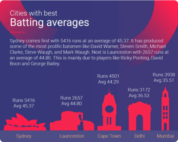
The UK's stock of government debt is high by international standards, but lower than a number of other G7 economies.
The UK's 10 year bond yield (one of the most relevent yields for long term fiscal sustainability) has tracked alongside those of other major economies over the last 30 years.
The Bank of England rapidly tightened monetary policy in early 2022 in response to the post-COIVD inflation shock.
This tightening, and the threat of fiscal dominance from the Truss-Kwarteng mini-budget, sent yields on UK Government debt soaring.
Some economists have warned that China and India may squander the benefits of their demographic dividend as their populations grow old and working age populations contract. One under appreciated aspect of both country's economic structure is the large proportion of workers employed in agriculture.
Nearly half of India's (and almost a third of China's) workforce are employed in agriculture. This is a huge number of people working in a relatively low productivity sector. This compares to around 1-2% of the workforce in developed countries (some of whom have large agircultural output).
If India and China are able to raise agricultural productivity even slightly, they will free up a huge pool of labor, which may help ameliroate the affects of demographic transition.
Source: https://www.espncricinfo.com/story/which-top-cricket-city-would-win-the-world-cup-1196522
Found on ESPN Cricinfo - this visualisation really doesn't add anything and is hard to decipher.
Data sourced from the World Bank API. The API has a structured base URL: https://api.worldbank.org/v2/country/[country_codes]/indicator/[indicator_code]?format=json.
Country codes are separated by semicolons (e.g. AU;kor for Australia and South Korea), and indicator codes specify the data series (e.g. BN.CAB.XOKA.GD.ZS for current account balance as % of GDP). Additional parameters include format=json for JSON output and per_page= to control pagination.
Full URL used: https://api.worldbank.org/v2/country/AU;kor/indicator/BN.CAB.XOKA.GD.ZS?format=json&per_page=130
The data for this chart was scraped from the International Trade Wikipedia page. Wikipedia initially blocked my scraping attempts when using the techniques we learnt in class. Using the requests package got around this issue. See colab notebook with script and with further commenatary here.
Charts made with the FRED API and automated with loops. These are the US equivalents of the six parameters that appear in Table 1.1 of Australia's Federal Budget. Colab notebook where analysis was carried out is linked here.
Gross Value Added (GVA) per hour worked varied significantly across Welsh local authorities in 2023. This chart was created using TopoJSON geographic data and ONS economic statistics.
Each point on this map represents one of Scotland's whiskey distilleries. I found this data by scraping a list of distilleries and automating a google maps search for their coordinates.
I made this chart with the autocpi dataset, I did the reducing / collapsing / grouping in a colab notebook here. Afrer cleaning, I saved as a CSV, loaded the data into vega editor and made the chart. Interestingly popcorn price seem pretty tightly clustered and didnt have a super sharp increase following COVID.
Similarly this chart is also from the autocpi dataset. The cleaning was done in this colab notebook here. I took a different approach with this one where instead of saving as a csv, this time I made the chart in altair and just directly saved as a json spec. Olive oil prices have increased significantly in the last few years following bad weather and higher input costs.
Both of these charts are recycled from my project. This chart shows public transport trips per person across Australian capital cities. It has a slider to change the start and end years.
Another recycled chart, this one showing motorised passenger kilometres by mode in Australia from 1980-2024. It has a dropdown menu to switch between total and per capita measures, and filter by travel type (Private, Commercial, or Public transport).
These two charts are also recycled from my project. This chart shows a histogram of distributions for bus service reliability in Canberra. The chart shows the distribution of arrival time deviations across different routes. It shows the percentage of trips at different delay levels for a specific route, with colors indicating reliability categories from excellent (±1min) to very poor (10+min).
This chart uses gradient boosting regression (supervised learning) to predict public transport use for small areas in Canberra using demographic variables from the census.
Generative AI (Claude, Chat GPT, Gemini, Copilot) was used in producing this website. These tools were used to troubleshoot code, help produce the more complicated python scripts, and pull together the readme file.